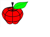
Our Logo
We are very proud that Matthew Mireles designed our unique red apple logo to symbolize
our many aims, qualities, resources, and attributes of our Foundation. This apple
portrays peoples’ needs for wellness, prevention from injury and illness, education
and knowledge about their health, support, growth, empowerment to improve quality
of life.
The single leaf represents our special, unified roles as leaders, researchers, educators,
collaborators and partners in our mission and vision to promote and improve patient
safety and health care quality.
Grid lines represent the earth’s longitudes and latitudes that include and convey
our global and universal reach to learn and share research and knowledge.
Red demonstrates the vitality and ambition of our Foundation and the ripe timing
of our Community of Competence™ as a framework and method to accomplish our goals.